ADHD ONLINE
Designing a healthcare app for practitioners and patients
1. Overview
Background & Goals
ADHD Online is a digital clinic offering assessment and treatment for neuropsychiatric conditions. During a three-month internship at the consulting agency Nexer Maverick, I worked on a pro bono project together with developer interns to support healthcare professionals and patients by improving an internal application. The project had previously been entirely developer-led, so I had the unique opportunity to shape the user experience from the ground up and introduce UX thinking into the process for the first time.
Project goals
Establish a style guide and design system to ensure consistency and efficiency throughout the application’s design.
Redesign the user flow that allows healthcare providers to create customized forms, which are sent to patients to assess neuropsychiatric conditions.
Problem Statement
Before this project, the internal application used by ADHD Online’s healthcare providers lacked a clear user experience and visual consistency across the application. The tool had been developed without any prior UX involvement, resulting in confusing workflows and an inconsistent interface throughout the platform. My work focused specifically on improving the user flow for creating and sending customized assessment forms — one of many areas that needed redesign to better support healthcare professionals and streamline their daily tasks.
Role
UX/UI design, UX research
Tools
Figma, Trello, GitHub
2. Challenges
Understanding a Complex Workflow
The application included a digital form creation flow, but it was still in development and not yet in use. Healthcare professionals were still relying on paper forms. My task was to redesign the flow to better meet user needs and prepare it for real-world use. Although requirements had been mapped out, the process was complex, with varied form structures and conditional logic, such as follow-up questions triggered by patient responses. Understanding these needs and translating them into a clear, intuitive interface was a major challenge.
Applying UX late in the process
I joined the project after the initial version of the form creation flow had already been designed, without any UX input. This meant I had to work within existing structures and constraints, some of which couldn’t be changed due to time or development limitations. It was a challenge to improve the user experience without starting from scratch, and required careful prioritization and negotiation to make meaningful UX improvements where possible.
Building a design system from scratch
As this was my first time building a design system, I had to conduct research on best practices, design tokens, and how to create reusable, interactive components in Figma. This was essential to ensure consistency across all UI elements and streamline the design process. The challenge was not only learning how to structure the system, but also making sure it was flexible enough to scale as the project developed.
3. Design System
Creating a Base for Consistency and Collaboration
Although parts of the app had already been developed, there was no design system in place, leading to inconsistencies in spacing, color usage, and component design throughout the application. To address this and ensure a cohesive user experience, I created the ADHD Online Design System.
The design system was built based on industry best practices, drawing inspiration from well-known systems such as Material Design. At the same time, I tailored it to meet the application's specific needs and requirements.
I held frequent meetings with my developer colleagues to ensure the design system is aligned with developer workflows and technical requirements. The work on the design system was an iterative process, and the system was continuously developed and updated throughout the project.
Design System Process
Step 1
Research on other design systems
Step 2
Define design system needs
Step 3
Developer communication
Step 6
Iteration and refinement
Step 4
Build design system
Step 5
Developer communication
Design System Highlights
☑️ Consistent Spacing and Grids
A spacing system and layout grids are fundamental to maintaining alignment and structure across designs.
☑️ Component Library
Reusable components with well-documented states (hover, active, disabled) are essential for consistency and efficiency.
☑️ Accessibility Standards
Supporting inclusivity and compliance with WCAG-compliant colors and clear focus states.
☑️ Design Tokens
Implementation of design tokens to ensure scalable and consistent use of WCAG-compliant colors, typography, spacing, and component styles. This approach simplifies collaboration with developers, enabling seamless integration and easier future updates.
☑️ Documentation and Onboarding
Clear documentation or resources make the system usable and maintainable by all stakeholders.


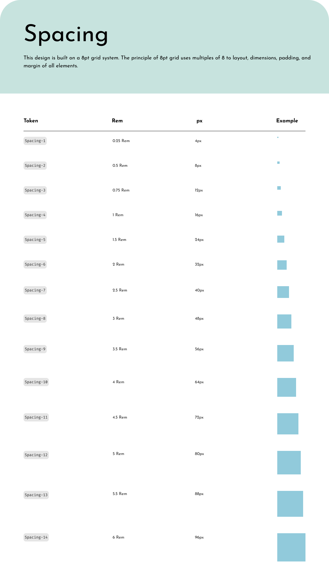
A sneak peek at the ADHD-design system style guide, featuring colors, typography, and spacing. All colors meet WCAG requirements and the typography is defined for both mobile, tablet and desktop.

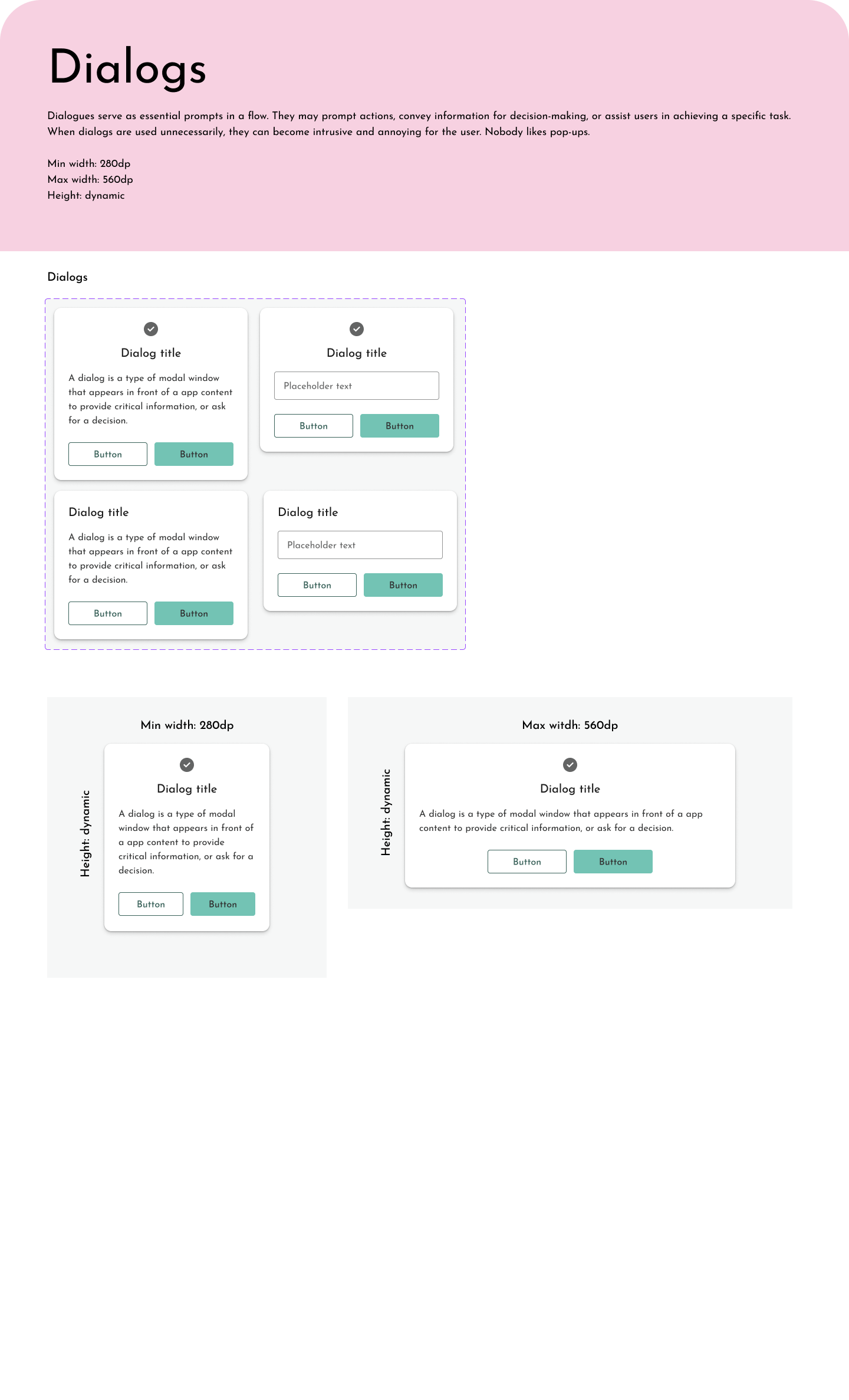
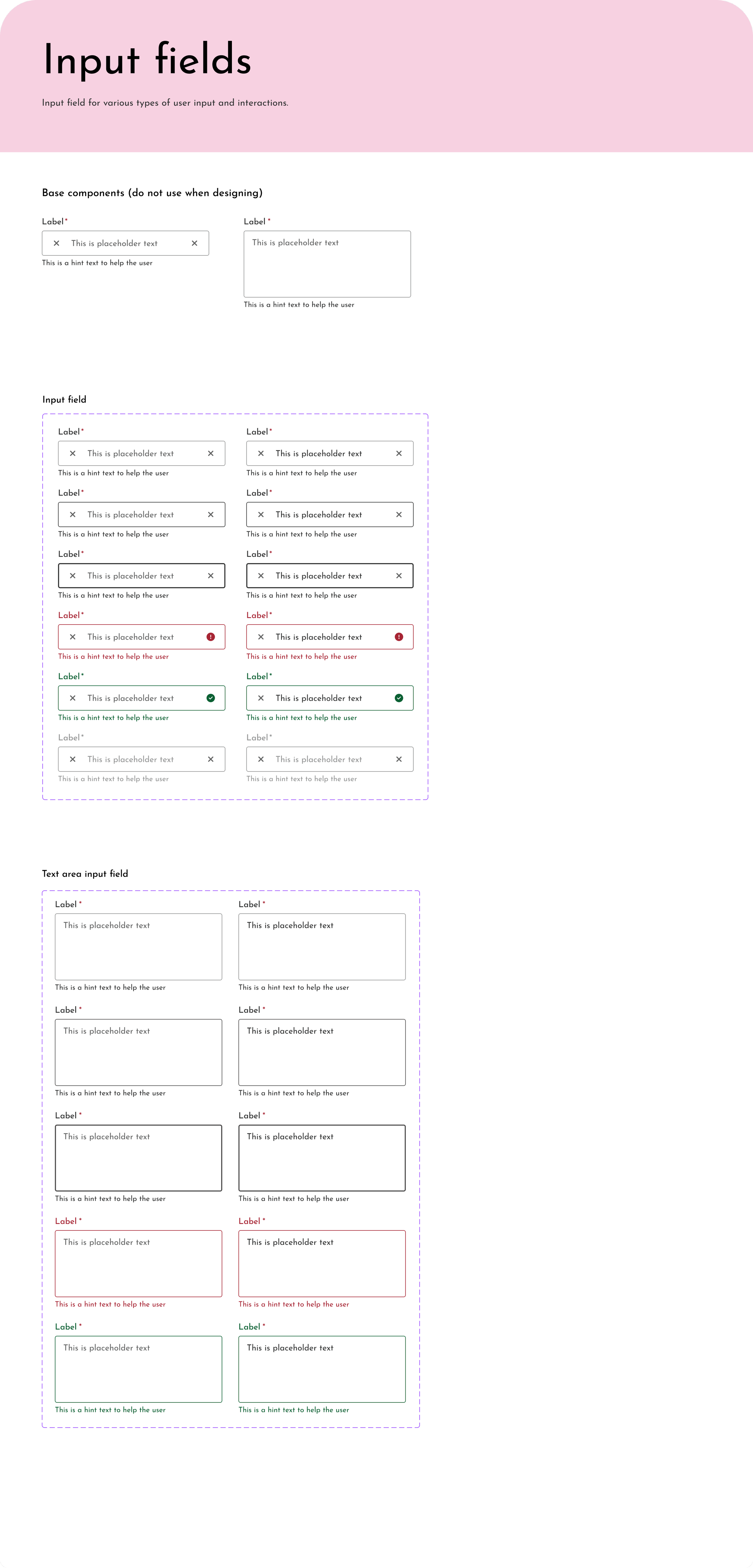
A sneak peek at the ADHD-design system component library, featuring buttons, dialogs, and input fields.
4. Redesign of the “Create Form” User Flow
Design process
Step 1
Research
Step 2
Design & feedback
Step 3
User tests
Step 4
Iterate
Step 1 - Understanding the Flow and User Needs
The create form flow enables healthcare providers to create customized forms that can be sent to and completed by patients to assess neuropsychiatric conditions.
There was already a version of the flow (altough not live) with the required functionality. This version was designed by developer interns and had never been tested with users.
I had several meetings and conversations with one of the doctors at ADHD Online during this time to better understand user needs and how they would use the application. I also looked at paper copies of the forms currently sent out to patients. This helped me to understand the requirements for the application.

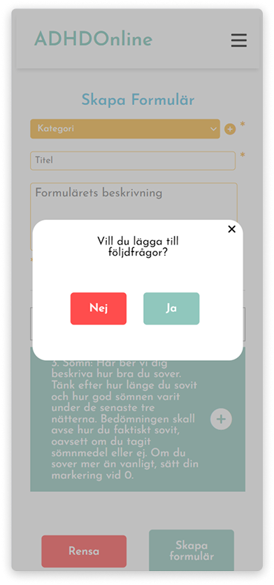
Part of the “create form flow” before the re-design.
Step 2 - Designing Wireframes & Feedback
To begin the redesign, I first focused on applying design best practices and principles, such as visual hierarchy, clarity, and consistency. I created a greyscale prototype in Figma that incorporated these foundational design improvements and aimed to streamline the flow for easier navigation. This initial approach allowed me to apply a clean, functional structure before refining the design based on user feedback.
Throughout the process, I held regular meetings with the client and developers to ensure alignment on the direction and gather any necessary insights. I also consulted with my mentor at Nexer Maverick, a senior designer, who provided invaluable feedback to fine-tune the design.
The prototype underwent several iterations before it was finalized, and user testing was conducted to validate the design changes, ensuring the final product would be intuitive and meet user needs.

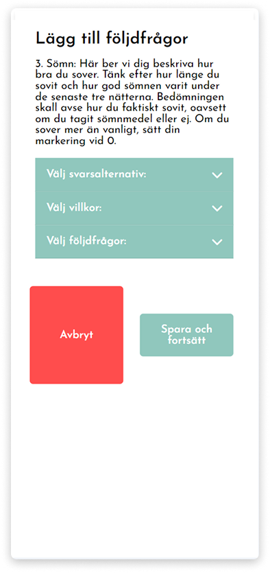
Wireframes from the “create form” flow.
Step 3 - Testing the Prototype with Users
When the prototype was finished, I performed user tests with three healthcare practitioners from ADHD Online. The tests were done remotely using a qualitative approach and the think-aloud method. The test participants got to complete tasks concerning flow and answer questions.
Test highlights - What works well?
✓Users use the search function without problems
✓Users understand directly how to add questions
✓Users understand how to edit the order of selected questions
✓ Users understand how to delete questions
Test highlights - What can be improved?
✖️Users have trouble finding the questions that have already been added.
✖️Users have trouble understanding that a question has been added despite visual feedback.
✖️Users want some fields in the forms to be mandatory
✖️ The part of the flow where follow-up questions can be added has several issues and is not intuitive for users
Step 4 - Iteration
Based on the feedback from the tests, I iterated on the prototype in collaboration with the rest of the team. The final version was presented to the customer for approval before development.
5. Final designs
Mobile-First Design Approach
The project was designed with a mobile-first approach, meaning all designs and testing prioritized the mobile experience. One of the key challenges was adapting the app’s flow to accommodate the required functionality within the constraints of a smaller screen.


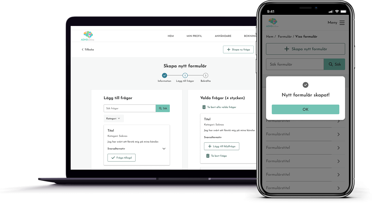
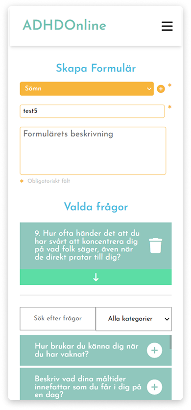
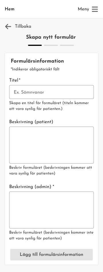
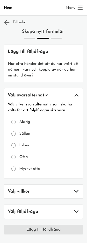
Part of the “create form” flow for mobile after the redesign.
Desktop Designs
After completing the mobile designs, I adapted the application for desktop. Designing for desktop was more straightforward due to the additional screen space, which allowed for greater flexibility in organizing content and functionality.
While the user tests focused on the mobile version of the app, it would have been valuable to test the desktop version as well to ensure usability across devices. Reflecting on this, I recognize the importance of testing all key platforms to validate the design’s adaptability and effectiveness in different contexts.

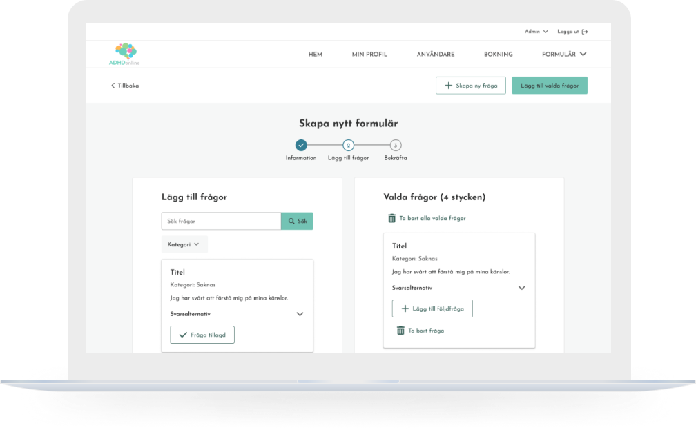


Part of the “create form” flow for mobile after the redesign.
6. Key results
Streamlined User Flow & Improved Usability
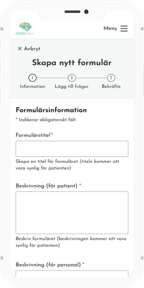
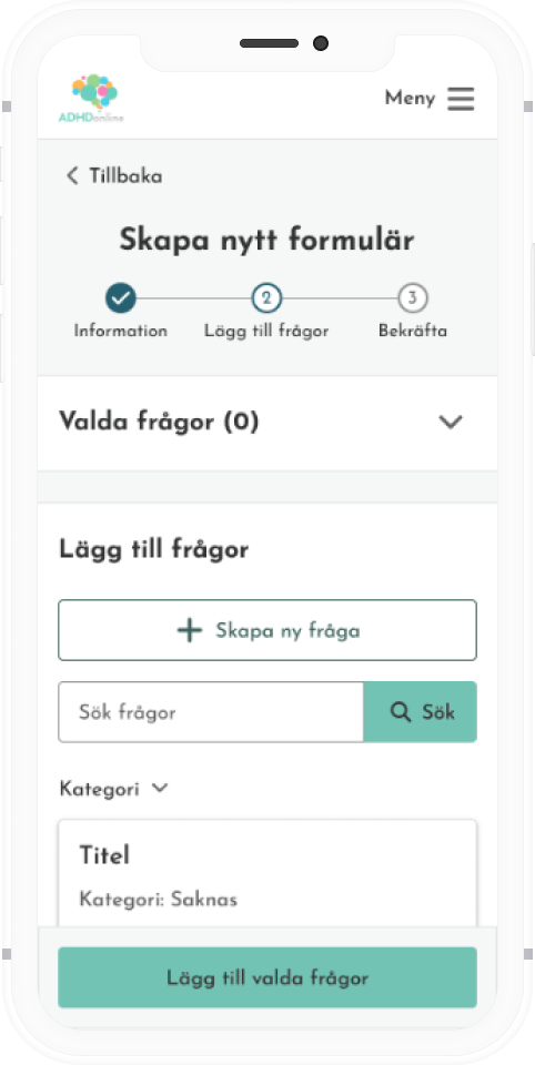
Refined Form Creation Process: Simplified the form creation flow by breaking it into different steps, removing categories that had proven unnecessary to display, and reworking how follow-up questions are added, making the flow more intuitive, clear, and efficient for users.
Process Indicator: Added a step-by-step progress indicator to help users track their progress and reduce confusion.


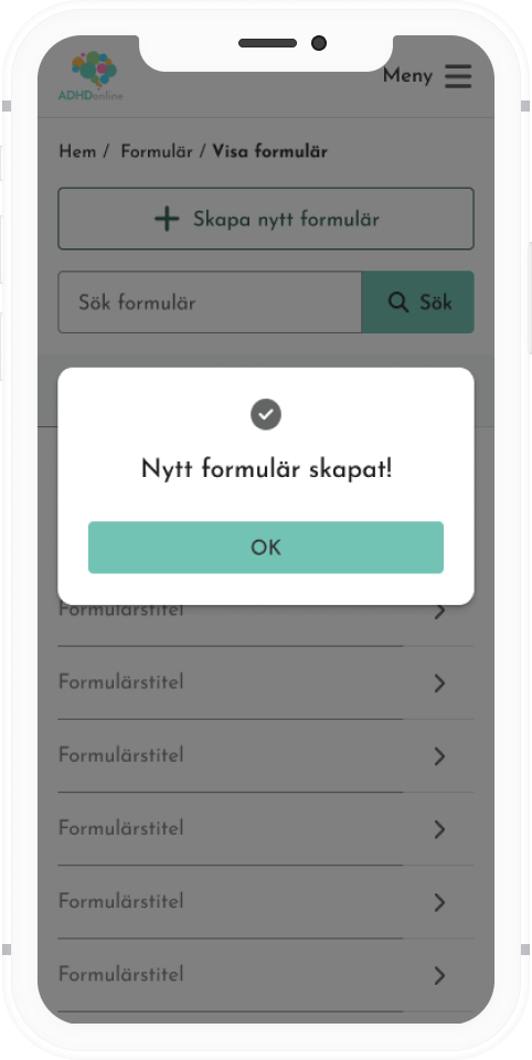
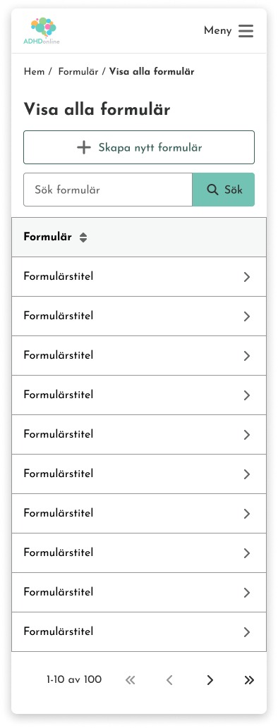
Before
Before
After
Accessibility & Design Enhancements
Improved Accessibility: Applied cohesive colors with sufficient contrast to meet WCAG standards, along with consistent use of typography and spacing for enhanced legibility and visual rhythm.
Refined Labels & Headings: Improved and clarified labels and headings to enhance users’ understanding of each element's purpose, helping guide them through the form-building process with greater ease.

Before
After
App-Wide Navigation Improvements
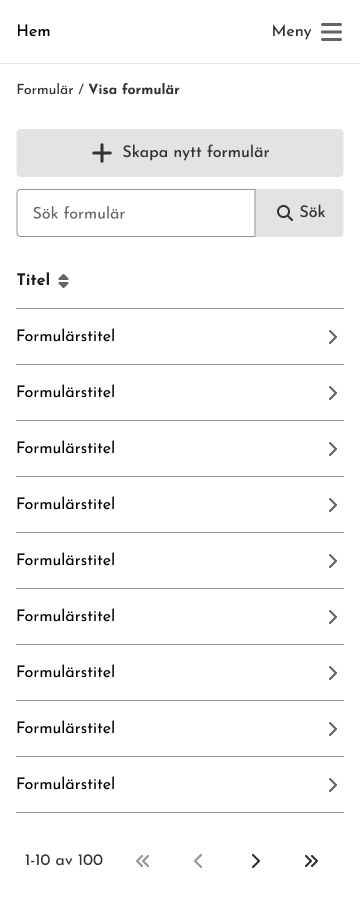
Navigation Redesign: Improved the application menu (the new structure was already set), making it easier for users to move between sections and find what they need.
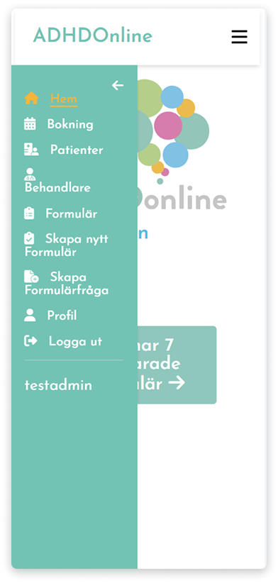

After
7. Reflections & Takeaways
Beyond Design: Planning, Leading, and Coordinating UX Projects
During this project, I had the opportunity to develop my skills in planning, leadership, and strategic design. A key takeaway was stepping into a leading role, not only in my tasks but also in communicating with the client and organizing and leading meetings for the entire project team. These aspects were critical in creating the designs I delivered. This experience taught me that a UX designer’s role often combines design expertise with leadership and coordination to effectively drive a project forward.
Collaboration & communication with developers
Working closely with developers during this project gave me a much deeper understanding of their workflows and how designs are implemented in practice. Our team collaborated well, supporting one another to achieve the best results.
The biggest takeaway for me was the importance of frequent and open communication. By consistently sharing my designs with the developers and ensuring they were practical and feasible, we were able to create solutions that aligned well with both the design vision and technical constraints.
Sticking to MVP: A challenge to overcome
Another important lesson I learned during this project was to focus on the minimum viable product (MVP). Knowing when the design was “good enough” to meet the project goals without overcomplicating or over-polishing was challenging.
Initially, it was tempting to keep refining and adding features, but I realized this could lead to unnecessary delays and scope creep. By staying focused on the core needs of the users and the project objectives, I learned to stick to MVP during the project.