VIRTUAL ZEETS
A website for buying and experiencing VR events
1. Overview
Project description
This project was part of the “Prototyping for UX production” course within the UX Design degree program at EC Utbildning. The project is based on a fictional company, Virtual Zeets, a cutting-edge company specialising in ticket sales for VR-enabled events, including concerts, shows, and more.
1. Design a homepage for desktop that will feature a curated selection of VR events, providing an enticing starting point. Events will be categorized into genres and users will have the ability to view details for each event, including date, time, pricing, and a succinct description.
2. Design options for users to sort events based on factors like date or category to facilitate efficient event discovery. Additionally, a range of filters will be available, allowing users to narrow down their search by event type, price range, and more.
Role
UX design
Tools
Figma
2. Design process
Empathize
Interview
Competitive analysis
Define
Empathy map
Personas
Ideate
User flow
Story board
Crazy eight
Prototype
Low, mid-, and high fidelity
Design critique
Test
User tests
3. Research
Understanding VR events and the user
Before designing, I needed to understand the users and their needs. To guide the research process forward, I defined the following research goals:
1. Understand who attends VR events and their motivation for doing so
2. Identify frustrations when looking for / or buying tickets for events
3. Identify what features that would be most valuable for users when looking for / or buying tickets for events
Methods

Articles & online forums

Semi-structured group interview
Competitive analysis

Personas & empathy map
Key findings
1. Who attends VR events?
Tech Enthusiasts and gamers
Art and entertainment fans
People who cannot physically attend events for different reasons
2. Why do people attend VR events?
Immersive experiences without travel
Unique experiences, perspectives, and interactivity
Cost-efficient and environmentally friendly
Social interaction and inclusivity for all attendees

3. What are the main pain points when finding and buying event tickets?
Quickly finding events that fit user preferences and criteria
Quickly finding events that fit user interests when they are not sure what they are looking for
To know if the event will be worth the money and time
4. What features would be most valuable for users?
A filter function that helps them to sort events and find what they are looking for
A feature that helps users find events that fit their interests and preferences
A feature that helps users make a judgment if the event is worth their money or not
4. Ideate & Prototype
Getting the Ideas on Paper
I created a storyboard and used the crazy 8 eight method to generate design ideas for potential solutions and initial designs. I also created an initial sketch of the user flow to get an overview of the user journey from start to finish. This was followed by mid- and high-fi prototypes. The ideation and prototyping process involved regular design critique sessions with classmates and my teacher to receive feedback on the designs. I also performed two user tests each on the mid-fi and high-fi prototypes.

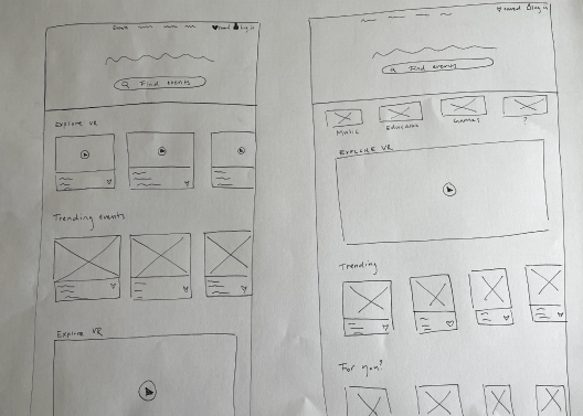
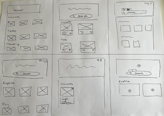
Storyboard, crazy eight, and initial sketches.

User flow.

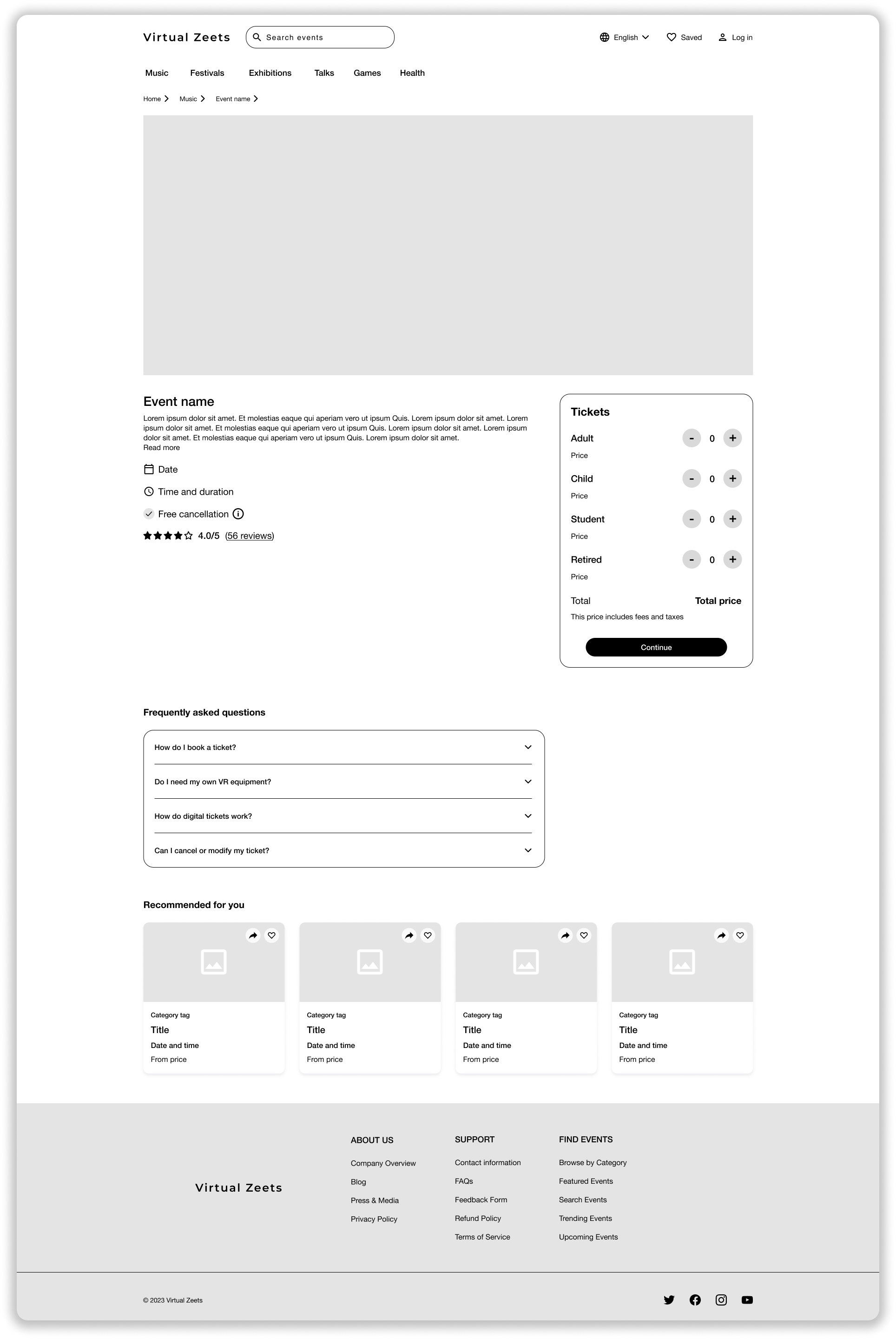

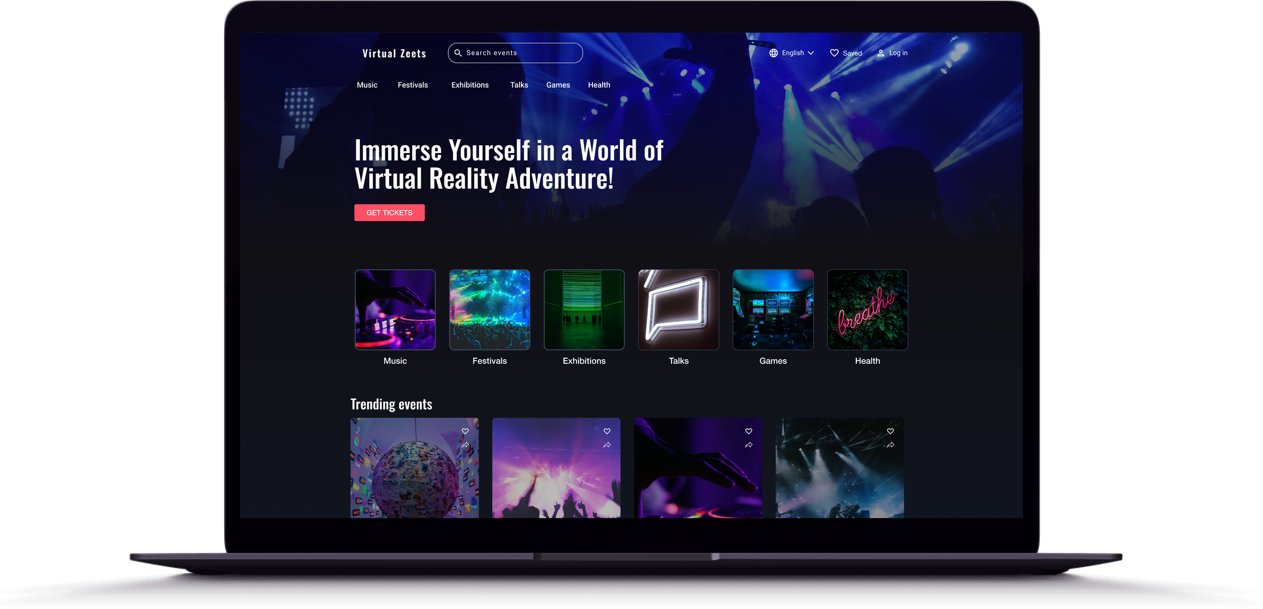
Wireframes of landing page, product listing page and product detail page
5. Test & iterate
Validating the ideas
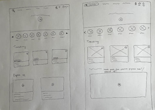
I used the think-aloud method to perform the user tests both on the mid- and high-fi prototypes. When testing the mid-fi paper prototype, I asked the users to point where they would click, while the high-fi prototype was interactive. It was a conscious choice to keep the high-fi prototype in greyscale, as the focus was on the flow and functionality, not the UI. In total, I did four iterations of the high-fi prototype. Each iteration had me going back to the research phase and drawing table to sketch. Below is an example of the first and last iteration of the product listing page.
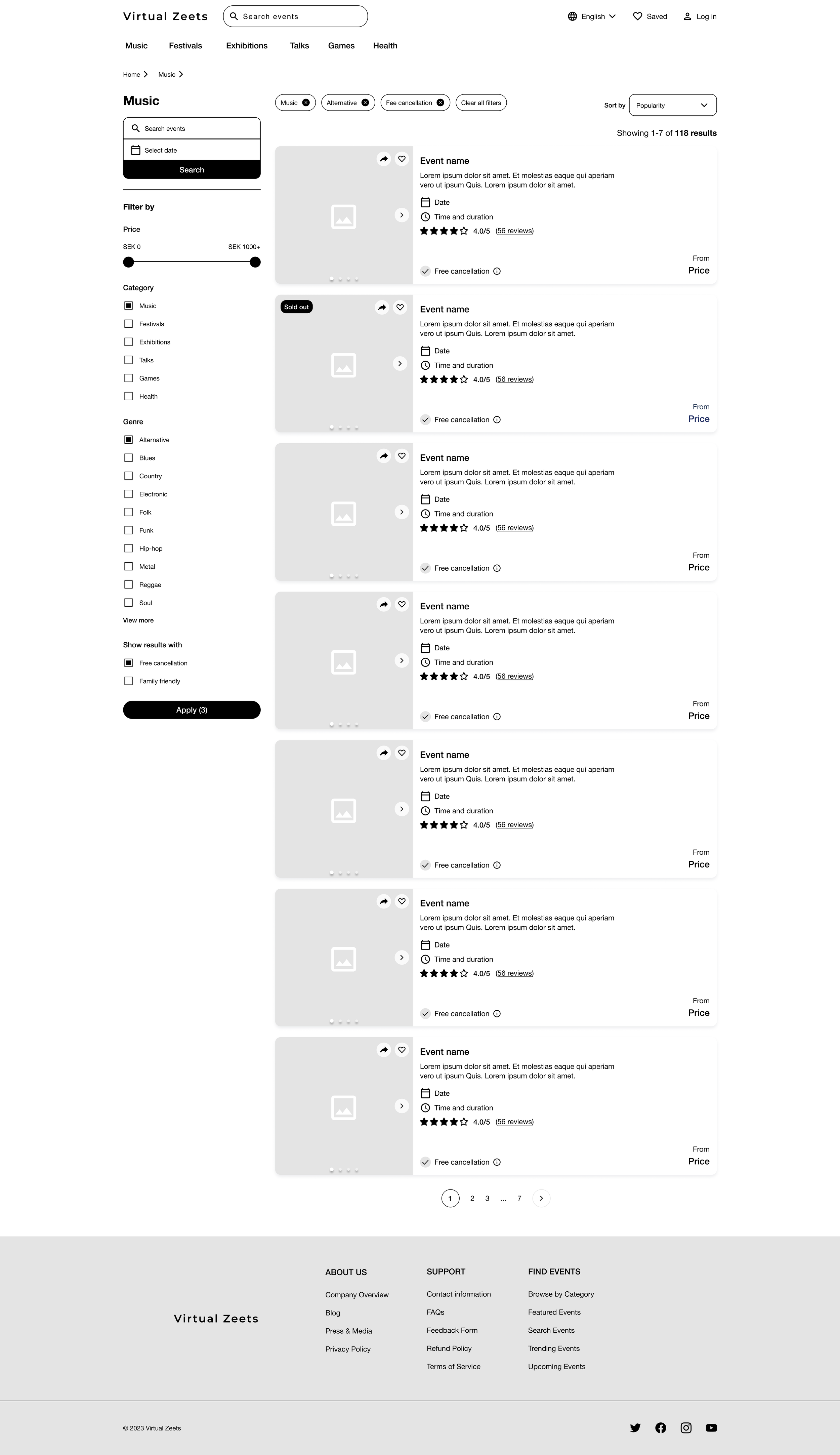


Wireframes - iteration 1, 2 and 3 of product listing page.
Iteration 1
Feedback from other UX designers in my course and results from the user tests indicated that the first version of the PLP had too much information and wasn’t easy to navigate and interact with.
Iteration 2
I hid the filters to remove the amount of information displayed on the page at first glance. I also redesigned the product cards to a smaller size to fit the new layout and include less information on each card.
Iteration 3
The third iteration of the product listing page. Following user feedback on iteration 2, I made adjustments to the design of the product cards. During the tests of the second iteration, users preferred the information displayed on the initial cards, as it aids in quickly scanning the PLP for an event. Therefore, these cards retain the information from the original ones but feature a slightly altered design to allow two cards to be placed side by side.
6. Reflections & takeaways
Continuous customer communication
Continuous and regular communication with the customer (in this case represented as my teacher) allowed me to ensure that my designs aligned with customer expectations and requirements. This allowed for an effective workflow and reduced the risk of time spent correcting errors or designing the wrong thing.
Using pen and paper as a medium
Creating prototypes using pen and paper is a quick and efficient way of trying out ideas. The paper prototypes allowed for quick iteration and were an excellent way of communicating and discussing my initial ideas with the customer.
Don't get caught up in the details
A big takeaway from this project was to focus less on the details in the lo-fi prototypes and focus more on bigger ideas and concepts. I found myself getting stuck in the details and needed to remind myself to zoom out and see the bigger picture, especially at the beginning of the design process. The details will form and come together as the process moves forward.